|
|
|
#1
 10-24-2007, 11:51 PM
|
|||
|
|||
|
In terms of best straight up emblem, I've got to give it to Nike. The fact that a ton of people tattoo that thing on themselves is testament to the power of the image.
If I may go on a tangent, I'm reading a pretty cool book on branding theory and it's effects called 'No Logo,' read by both advertising executive and adbusters alike because it is so damn good at explaining exactly how branding works. Among the most powerful brands outlined in that book are Nike, Coca-Cola, and McDonalds, but the author says that the Mac-Daddy of corporate brand identity is Disney, which curiously hasn't been mentioned here yet. While their logo doesn't spring to mind as easily as the swoosh or the golden arches, their brand identity is really pretty powerful when you think about it. Growing up, Nike and McDonalds were cool stores, but Disney kind of transcended being a corporation into just being a part of childhood which is really freaky. 
|
|
#3
10-29-2007, 05:10 PM
|
|||
|
|||
|
[ QUOTE ]
Among the most powerful brands outlined in that book are Nike, Coca-Cola, and McDonalds, but the author says that the Mac-Daddy of corporate brand identity is Disney, which curiously hasn't been mentioned here yet. While their logo doesn't spring to mind as easily as the swoosh or the golden arches, their brand identity is really pretty powerful when you think about it. Growing up, Nike and McDonalds were cool stores, but Disney kind of transcended being a corporation into just being a part of childhood which is really freaky. [/ QUOTE ] Brand identity =/= logo, though. The Mickey Mouse silhouette logo is pretty good, but not "upper echelon" imo.  Disney doesn't really have a corporate logo. They've got the stylized Disney logotype, but I don't think it really counts. And it's definitely not particularly ingenious, which I think was what the OP was looking for. A few I like that haven't been mentioned yet: 
|
|
#5
10-29-2007, 05:31 PM
|
|||
|
|||
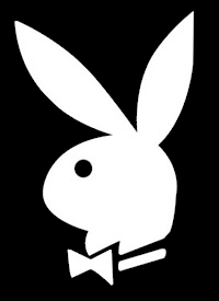
 i have a friend who wants this as a tattoo w/o the slashed circle. that guy is pretty menacing
|
|
#7
10-29-2007, 06:05 PM
|
|||
|
|||
|
as a designer i always take notice of logos and branding. branding of companies can be anything from the logo itself, to a typeface, to a pattern.
one i thought was brilliant was burberry. they created an entire brand out of a pattern.  i remember seeing a show years ago where they showed a bunch grade school kids the first letter of a company's logo, and most all the kids got the brand right away. one that sticks out in my mind is.  i wish i could remember the other ones. i'm always more impressed with brands that use type so effectively (such as the fedex logo) then ones that use icons. although brands like apple and mercedes use theirs very well, when no type is needed to be recognizeable.
|
|
#8
10-29-2007, 06:34 PM
|
|||
|
|||

|
|
#9
10-29-2007, 06:50 PM
|
|||
|
|||
|
I think FedEx, Coke, etc are all awesome, yet the most incredible ones are where it's just a somewhat vague image yet you can instantly place it. Even more amazing is that Snickers one, where you can just place it because of the font and colours. Very very cool.
Windows was a great one that no one had thought to post. Here's another goodie :
|
 |
|
|


 Hybrid Mode
