|
#21
 07-24-2007, 06:40 AM
|
|||
|
|||
|
[ QUOTE ]
[ QUOTE ] I think these are becoming my favorite threads. They make me laugh as soon as I see them. The responses are usually good too. [/ QUOTE ] Agreed, these threads are awesome. OP needs to make as many photoshop threads as possible. [/ QUOTE ] Will do 
|
|
#25
07-24-2007, 10:59 AM
|
|||
|
|||
|
You objects are all too similar in size so there is no focal point. You need a better picture of your subject. I would try and create borders. Here are a couple of things that I have done.
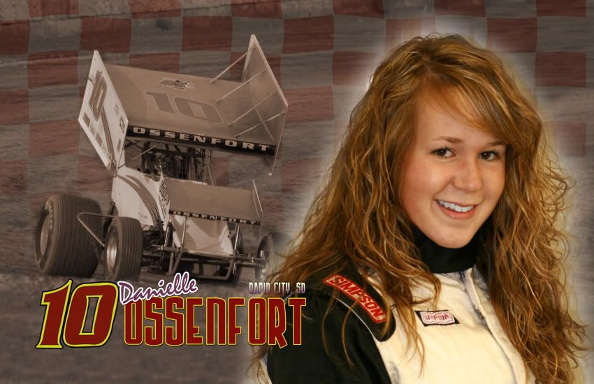   Not the best in the world but may help you with some ideas, even though they are racing themed.
|
|
#27
07-24-2007, 11:13 AM
|
|||
|
|||
|
Constructive criticism: this crap sucks and you should stop posting it here.
|
|
#28
07-24-2007, 11:19 AM
|
|||
|
|||
|
I feel like the various textures don't marry well together and look piecemealed instead of congruent.
PS, I'm not an artist.
|
|
#30
07-24-2007, 11:34 AM
|
|||
|
|||
|
[ QUOTE ]
PS, I'm not an artist. [/ QUOTE ] Neither is OP!
|
 |
|
|


 Linear Mode

