|
#31
 06-20-2007, 02:21 AM
|
|||
|
|||
|
Hi Roxysurfergirl00
I'm going to let others make their initial comments before I do. However, Alan Schoonmaker's picture should also go on the back cover as the third picture in a row under the title. Best wishes, Mason 
|
|
#33
06-20-2007, 03:01 AM
|
|||
|
|||
|
Hi Gonso:
No. Foil requires a different type of printing than what we do. Best wishes, Mason
|
|
#35
06-20-2007, 09:31 PM
|
|||
|
|||
|
the covers look great. when will i be able to read them?
|
|
#36
06-21-2007, 05:19 PM
|
|||
|
|||
|
Congrats to all the winners. Very much looking forward to reading the books and to seeing the final covers.
Here's some feedback/advice for each of the covers. Gonso/PNL: I liked the idea of making the Roman numberal I or II the same color (red or blue) as the color used to fill the king. The dark gray on a light gray background is a little too subtle. Also, maybe it's just me, but the column of suit symbols on the right looks just a sliver (pixel or two) higher than the king. Hard to tell for sure without a really hi-res shot. For incorporating the vol # on the spine - How about simply putting the red "I" or blue "II" after the NLHE. OMGuraBot/SNGS: I also liked the black background better. It made the chips stand out more. If the black is too dark, maybe try a background green that contrasts more with the green used on the chip. Also, I think there's a typo on the spine. "go" and "strategy" are not capitalized. Roxysurfergirl/WCHS&SHLHE: Looks like the hardest part of converting your design is arranging this book's really long title. One thing I really liked about your design (PNL version) is how the black script font fell just perfectly inside the light-colored suit symbols on the front cover and spine. I wonder if the title can be reworded so that some of the adjectives come after "Hold 'em". For example, High Stakes and Short-Handed Limit Hold 'em: World Class Advice. Basically, just move some of the words in the title into a subtitle. Can anyone else think of a way to reword and/or shorten the title? Another challenge is keeping the title distinct enough from the Stox book. Mason would obviously have to approve of any change, though.
|
|
#37
06-21-2007, 07:46 PM
|
|||
|
|||
|
Mason,
Here is the cover with red and white for the text on the chip. I think the white is the way to go, as it stands out more and is consistent with the rest of the text. Bozman, Thank you for the feedback. I agree that the black background is better. I tried different green backgrounds, but no matter the shade a good contrast wasn't there. -Jim 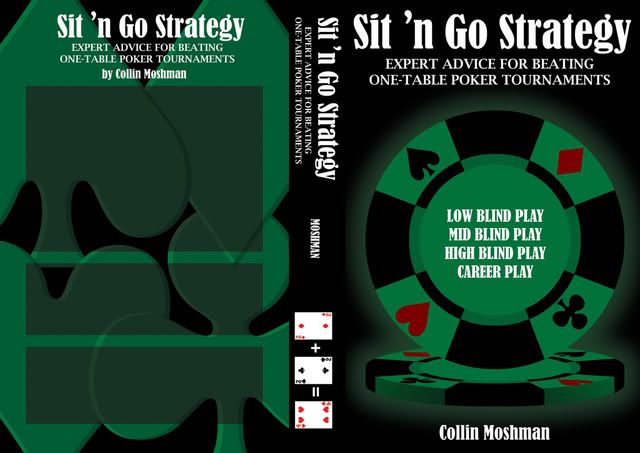 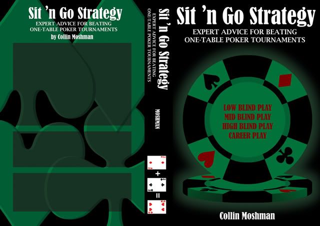
|
|
#38
06-21-2007, 08:08 PM
|
|||
|
|||
|
Hi OMGuraBOT:
I think this needs a little more work. The problem, looking at it now, is that the chip is too dark relative to the background. A solution might be to make the black sections of the chip another bright color. In fact, that would be consistent with the design on many casino chips. So why don't you give that a shot. Thanks and best wishes, Mason
|
|
#40
06-21-2007, 09:14 PM
|
|||
|
|||
|
I am totally blown away by all 3 of these and several of the "losing" covers. Great work everyone.
Roxysurfergirl's cover is fantastic, the best in fact, but I don't like the "World Class" part being stuck onto the corner. OMGuraBOT's latest attempt with white writing on the chip gets the balance just right IMO. Red version is horrible though. Gonso's looks perfect.
|
 |
|
|


 Linear Mode

