|
#1
 06-06-2007, 11:53 AM
|
|||
|
|||
|
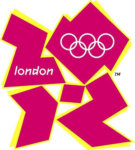
Since the Brits paid over 400k pounds sterling for this gem of an Olympic logo, I figured BBV4L could come up with a suitable replacement. Please help our lads across the sea before they embarrass themselves any further.

|
|
#2
06-06-2007, 12:17 PM
|
|||
|
|||
|
Is it me or does that look a lot like this?

|
|
#5
06-06-2007, 12:25 PM
|
|||
|
|||
|
Apparently it took an entire year to "develop". I'm starting to regret not going into graphic design.
|
|
#6
06-06-2007, 12:27 PM
|
|||
|
|||
|
i put a lot of effort into it, but i just couldn't come up with anything worse than the actual logo.
|
 |
|
|


 Linear Mode

