|
#1
 10-14-2007, 08:25 PM
|
|||
|
|||
|
While I'm watching football today...Im basing my rankings on each teams logo, uniforms and over-all look. Both home and away uniforms are considered as a whole, so even if one team has an exceptional home uniform but an average away one, I give them both equal weight and one overall ranking. I tend to like old-school and dislike newer uniforms, so take that for what it's worth.
********Also, beware for some mild NSWF below******** 1. Dallas Cowboys  Now, I hate the Cowboys, but even I have to admit their classic silver and navy star logo and uniforms are the classiest and best-looking of the whole NFL. 2. Pittsburg Steelers  Old school and tough-looking. Working class hero stuff. Great uniforms, and the logo being on only one side of the helmet is cool. 1. Kansas City Chiefs  The class of the old AFL teams. It helps that the other AFL teams have all changed their original (and better) logos and uniforms. Probably the best mostly red uniform in sports. 4. New Orleans Saints  Surprisingly high. But the fleur de lis and the color scheme is ballsy yet attractive, you know? Plus, the uniform just "feels" like their city of origin, so that gets bonus points. 5. Chicago Bears  Sometimes simplicity works, as does sticking to your roots. Could anyone even imagine the Bears changing their look even a little? Of course not. 6.San Francisco 49ers  The color scheme really shouldnt work, but it does I love the old time feel to their look, and, like the Saints uniforms, it just matches their city. 7. San Diego Chargers 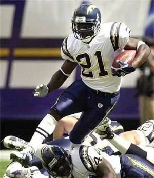 If The Chargers always went with their powder blue jerseys and white helmet, theyd win this in a walk its the best-looking sports uniform, ever. Even without it, the lightning bolt is perfect. 8.Arizona Cardinals  Bold, clean lines, with an easily identifiable helmet logo. What more could you want? Now if only they could actually make the playoffs 9. NY Jets  The Jets have a great color scheme and a nice logo - thank god they switched back to their classic JETS helmet. The green and white is just about perfect, though. 10. Washington Redskins  The Redskins get docked for their racist name, but their uniforms are very cool. Love the Indian on the helmet its not nearly as good when the Indian is replaced by the R, however. 11. Detroit Lions  Nice colors, great logo, classic, old-school NFL. Very pleasing to the eye. 12. Indianapolis Colts  I like the traditional simplicity, however there is something just a bit boring about the Colts look. Could be their logo is nothing special. 13. Minnesota Vikings  The Vikings have a perfect name for their region and the Viking horns look great on their helmets. Not too sure why they went with purple, but it works anyway. 14. NY Giants  The Giants should take a page from the Bears playbook and stick with tradition. The old NY looks much better than the GIANTS logo. 15. Buffalo Bills  At times a bit too busy, but their logo is one of the few to have actually been improved upon over the years. The red, white and blue color scheme also stands out. 16.Atlanta Falcons  Thank god they got rid of their all black uniforms and returned to the red...I still like the old Falcon helmet better, though. 17. Philadelphia Eagles  Their modernization of their look (silver, black, etc.) just makes a classic uniform look like any other. 18. Green Bay Packers  The yellow and green is definitely unique, but the big, blah G on their helmet is boring. Nothing special. 19.Miami Dolphins  You either love or hate their colors I love em because teal and white just screams Miami! I also like the Dolphin logo but the graphic representation of the sun that surrounds it is awful. If your team colors look better on girls than your players, you've got a problem. 20. Oakland Raiders  The vaunted silver and black is, dare I say, not aging well. Their logo isnt bad but its not great. It does fit their fan base, though. 21. Seattle Seahawks  I really liked their original color scheme and clean Seahawk logo. What theyve got going now is a mess of drab colors. 22. St. Louis Rams  This is our first sad case the old blue and white rams uniforms were a thing of gridiron beauty when they put that horrible yellow-gold into the scheme of things, it ruined what was the best helmet in football, behind the Cowboys. 23. Jacksonville Jaguars  Colors that arent quite working together mixed with an okay helmet. They had a much better helmet logo their first year but it was too close to the Jaguar car manufacturer, so they had to change it. 24.Cleveland Browns  What logo? At least their blah colors match where they come from. 25. Carolina Panthers  The best of the bad uniforms. Its logo and color scheme is way too busy, but the colors are pleasing to the eye, if a tad feminine. 26. Denver Broncos  This uniform is a USFL reject and should be put to pasture wherever the old Bronco from their AFL helmet is currently residing - in fact, bring back the 'ol Buckin' Bronco! 27. Houston Texans  This uniform suffers from being completely forgettable. I cant even remember their logo without looking it up. Decent color scheme, though. 28. New England Patriots  This is the NFL, people, not Division II football, okay? A great team should have a great uniform, not this boring outfit. 29.Tampa Bay Buccaneers  This awful uniform and logo make me miss the old, gay orange pirate that was winking at us. However, the cheerleaders do seem to make it work! 30. Cincinnati Bengals  Do I really need to bring up the varicose pumpkin analogy? Halloween colors dont help, either. 31. Tennessee Titans  Another USFL reject uniform with a terrible logo. I mourn the old Oilers derrick on the helmet, but at least they kept the colors. Sort of. 32. Baltimore Ravens  Horrible colors, horrible logo, horrible name. The worst uniform in the NFL. 
|
|
|


 Threaded Mode