|
#411
 09-13-2007, 04:12 AM
|
|||
|
|||
|
im in, its set for autopick, you should change so that people that are there can properly draft

|
|
#412
09-13-2007, 12:52 PM
|
|||
|
|||
|
[ QUOTE ]
im in, its set for autopick, you should change so that people that are there can properly draft [/ QUOTE ] It will be. It was set to Live Draft earlier, but I guess it went to autopick since we didn't have enough people.
|
|
#413
09-13-2007, 05:54 PM
|
|||
|
|||
|
The jerseys are all out now. Here's the screenshots of all of them from the NHL08 video game...
http://picasaweb.google.com/nhllogos...tsNHL08Gallery
|
|
#414
09-13-2007, 06:15 PM
|
|||
|
|||
|
The Sharks jerseys look better in that screenshot than the other NHL 08 screens I've seen. Still, I don't think I like them. The horizontal stripe on the torso looks so out of place, as does the black.
The Thrashers' blue jersey looks sweet.
|
|
#415
09-13-2007, 06:18 PM
|
|||
|
|||
|
Some of them are quite different compared with previous versions, more so than I expected from the glacial-like NHL. Not surprised to see the Original Six minimally changed.
San Jose's almost look retro. Vancouver, Atlanta's powder blue and Florida look pretty bad.
|
|
#416
09-13-2007, 06:41 PM
|
|||
|
|||
|
Anybody noticed the Dallas home jersey yet? Completely different than the away jersey and will have the player's number below the Dallas text (not shown on that screencap), the first jersey to put a number there.
Actually, here's a pic... 
|
|
#417
09-13-2007, 07:32 PM
|
|||
|
|||
|
[ QUOTE ]
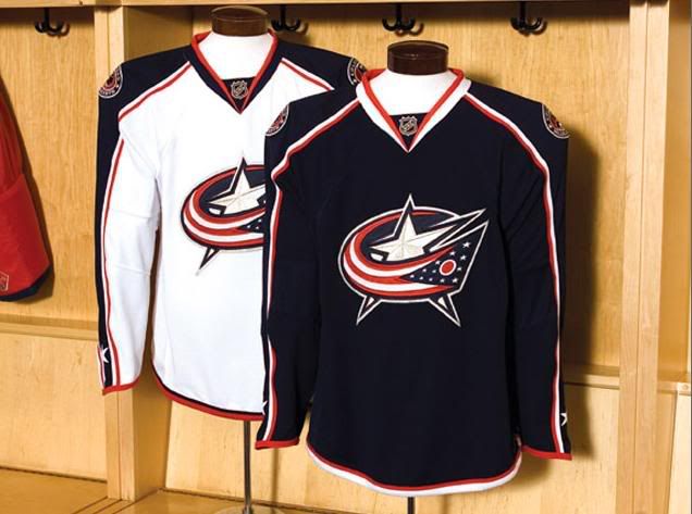
Some of them are quite different compared with previous versions, more so than I expected from the glacial-like NHL. Not surprised to see the Original Six minimally changed. San Jose's almost look retro. Vancouver, Atlanta's powder blue and Florida look pretty bad. [/ QUOTE ] Atlanta and Florida look good. Washington and Columbus are probably my favorites. Calgary, San Jose, Carolina, Chicago's Red, Nashville's blue are the worst, IMO.
|
|
#418
09-13-2007, 08:33 PM
|
|||
|
|||
 Ugh.  Ugh.  (Trim changed for this year). Sorry, but it just doesn't do it. Interesting how you don't mind Columbus, yet Nashville's is bad. Or is it that silver they've had for a while?
|
|
#419
09-13-2007, 10:52 PM
|
|||
|
|||
|
Nashville's doesn't look anything like Columbus'... so I don't get what you're trying to get at. Nashville's blue jersey looks like a t-shirt + long sleeve shirt underneath, Columbus' kind of looks like a soldier's uniform. Nashville's white isn't as bad as their blue, but I still don't like it.
  I think the ATL jersey you posted is ugly, but the one in the game looks nice... not sure if it will translate to looking nice in the real world though.
|
 |
|
|


 Linear Mode

