|
#262
 06-13-2007, 02:44 PM
|
|||
|
|||
|
TIME'S ALMOST UP!! (pun fully intended)
Mason scared me with his comments to Gonso, so I played with the overall contrast. Also, I felt left out of the "book collage", so there's that too [img]/images/graemlins/grin.gif[/img]    -ZEN |
|
#263
06-13-2007, 03:28 PM
|
|||
|
|||
|
Tinkering with details probably made it worse tho.
  Can't get the heart to look good at full transparency or the red background is just too strong i duno. Zen I can't resist. [img]/images/graemlins/smile.gif[/img] 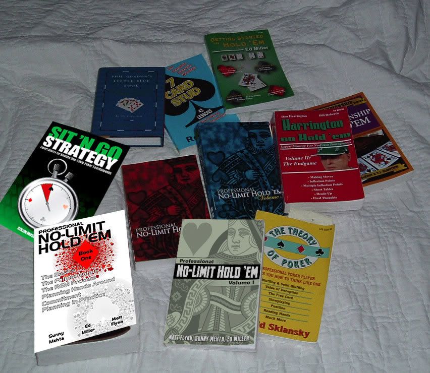
|
|
#266
06-13-2007, 10:18 PM
|
|||
|
|||
|
Zen -
I like the placement of the green background best on this version esp if it were applied to this version of your back cover:  Other minor ideas: 1) The "+" and "-" in the 2+2 logo would probably work better plain white, although I know they prob look better in full res than here 2) The title overlapping "sng" and "strategy" looks very good, but separating to me would look cleaner? The SNG part looks a little tall. I do like how much brightness they add to the cover the way you have it like that compared to the older version though. 2a) afterthought - "sit n' go" is the main theme, but it's being a little overpowered by "strategy", maybe that's what it is 3) Collin's name on the front cover - spacing the letters out just a tad more would improve legibility with the white against green These are all just my personal tastes of course, any of the variations you have look really solid, just my .02, and even the green has grown on me quite a bit. The whole thing was a very good concept |
|
#268
06-14-2007, 02:40 AM
|
|||
|
|||
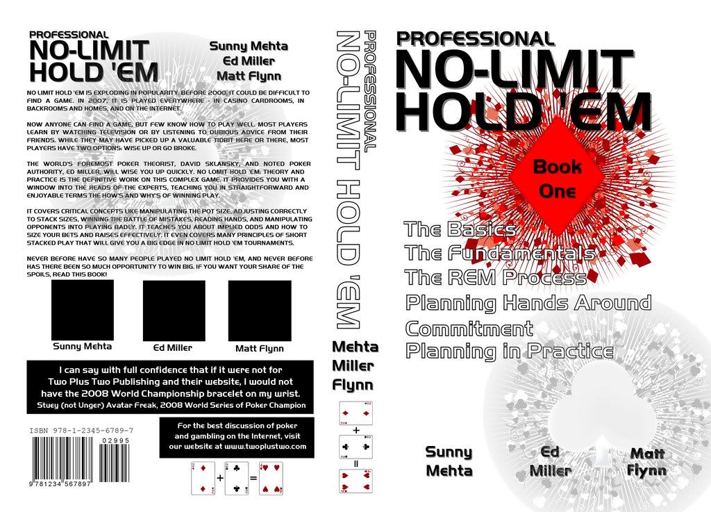
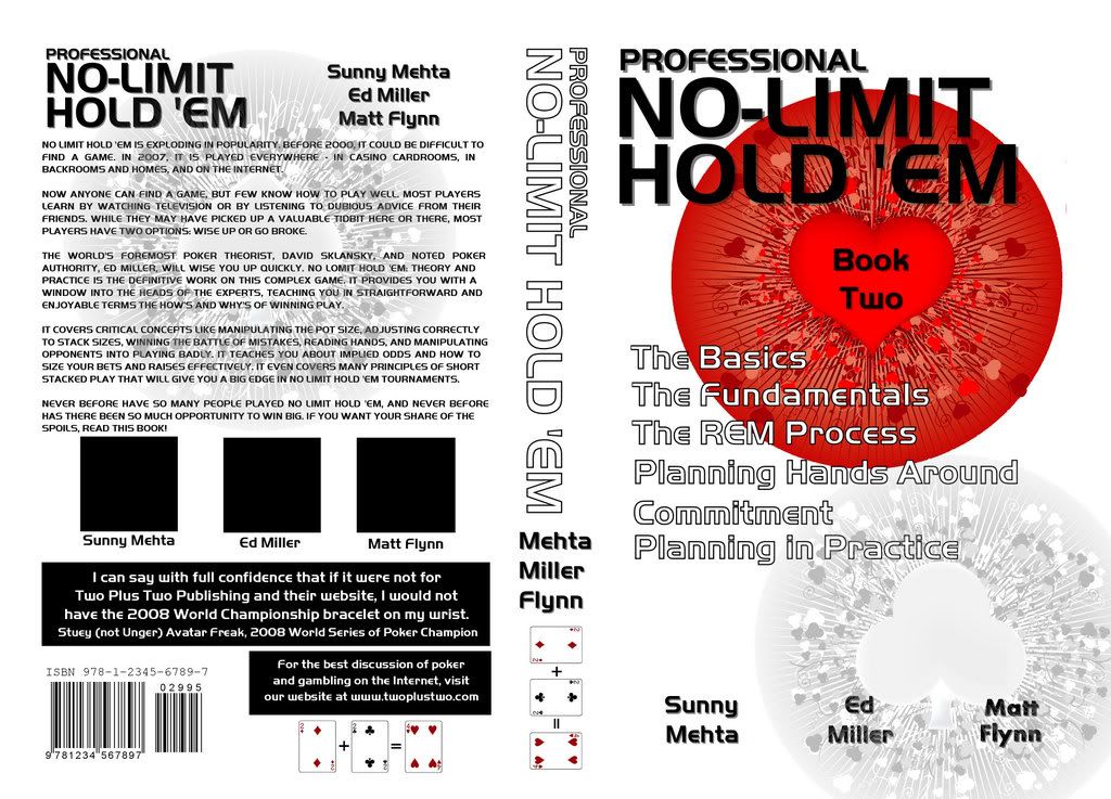
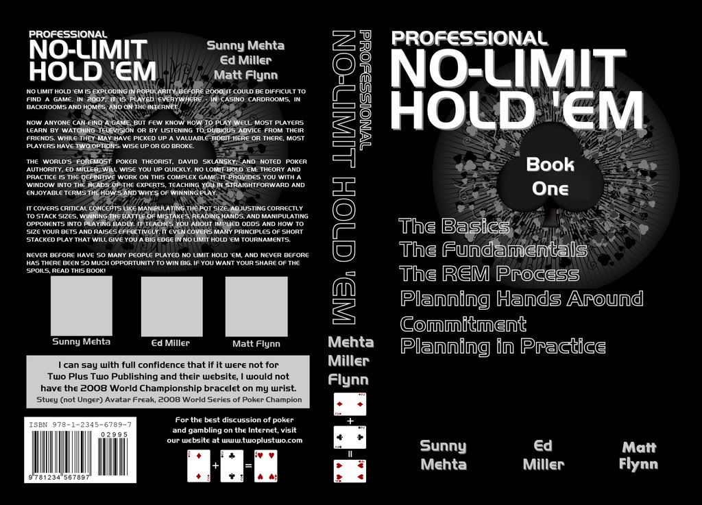 Tried one in black but something still is not right with mine. My idea was have some books in the series white and some black use the suits as markers depending on the number of books ect. I did slightly different layouts for each one but that was just to try different ideas. In a final version the layout for each book would be the same with only color and the type of suit changing. Oh well it was fun trying. I think it should be mentioned that gonso's cover will be plenty bright. We are photoshoping our cover into his picture and ours look brighter but it is not the truth. It just looks that way as his is shot in real light. Nice cover gonso I think it is my favorite. But wow there are ton of good ones. I just beg you Mason give us more time to compete for the Ray Zee book. [img]/images/graemlins/smile.gif[/img] |
 |
|
|


 Linear Mode

