|
#12
 07-23-2007, 11:42 PM
|
|||
|
|||
|
[ QUOTE ]
lastly i think that you should read up on composition. it's hard for my eye to focus on the subject (mikko). you have saku and the stanley cup both bigger than the main focus. [/ QUOTE ] This is the best advice yet. You should try to build a solid foundation in design and composition, then you can just look up Photoshop tutorials as needed. 
|
|
#13
07-24-2007, 12:15 AM
|
|||
|
|||
|
I think these are becoming my favorite threads. They make me laugh as soon as I see them.
The responses are usually good too.
|
|
#14
07-24-2007, 12:20 AM
|
|||
|
|||
|
[ QUOTE ]
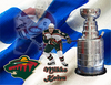 The player in the upper left corner is Mikko's older and more acclaimed brother, Saku. The background is a Finnish flag. Hopefully this one is better than my first few attempts because I spent more time on it. [/ QUOTE ] funny for many reasons
|
|
#15
07-24-2007, 01:41 AM
|
|||
|
|||
|
[ QUOTE ]
I think these are becoming my favorite threads. They make me laugh as soon as I see them. The responses are usually good too. [/ QUOTE ] Agreed, these threads are awesome. OP needs to make as many photoshop threads as possible.
|
|
#16
07-24-2007, 02:13 AM
|
|||
|
|||
|
Good advice on composition so far. I would add the stick, which should be a prominent feature is totally lost in the flat part of the cup. It would look a ton better down about 1/2 inch where it will stand out more. Also maybe if the stick is over white background when it's not over the cup, it will pop out more.
|
 |
|
|


 Linear Mode

