|
|
|
#2
 06-12-2007, 11:22 AM
|
|||
|
|||
|
MASON: Thanks for the info. Is the deadline set in stone
for the Zee book (i.e. are you def going to choose from what is here already)? Is there any pertinent info we can have to steer the design/look of the Zee book? Thanks! -ZEN |
|
#3
06-12-2007, 12:34 AM
|
|||
|
|||
|
Hi Gonso:
I'm going to let you know right now that almost all your cover submissions are too dark for use on a book shelf. Successful covers, which aid in selling books, are covers that catch someone's eye. If the design is too dark, even though it may be a very nice design, it defeats this aspect of the cover. Best wishes, Mason |
|
#4
06-12-2007, 01:32 AM
|
|||
|
|||
|
[ QUOTE ]
Hi Gonso: I'm going to let you know right now that almost all your cover submissions are too dark for use on a book shelf. Successful covers, which aid in selling books, are covers that catch someone's eye. If the design is too dark, even though it may be a very nice design, it defeats this aspect of the cover. Best wishes, Mason [/ QUOTE ] I've actually got a pitch black layer on the background at 20% opacity which is dampening the colors. The raw background unfiltered has enough color depth to stand a lot of lightening, although you can forget about ToP yellow with that texture. The colors are strong though, even if they're not especially bright - there's something of a tradeoff esp with the blue color. What you gain in lightness you could lose with color depth (which also catches your eyes), but I'll mess with it tomorrow. |
|
#5
06-12-2007, 01:50 AM
|
|||
|
|||
|
Hi Gonso:
Keep in mind that the decision as to which covers are selected are going to be based on exactly what I see here. So if your cover, or anyone's cover for that matter, appears darker here than what it actually would when printed, that does me no good. Best wishes, Mason |
|
#7
06-12-2007, 06:32 AM
|
|||
|
|||
|
Can't believe I missed this thread...
I'm going to have a crack at this in the three days that remain - jebus [img]/images/graemlins/crazy.gif[/img] Sounds like fun tho and the designs so far are amazing! |
|
#9
06-12-2007, 05:24 PM
|
|||
|
|||
|
[ QUOTE ]
Hi Gonso: I'm going to let you know right now that almost all your cover submissions are too dark for use on a book shelf. Successful covers, which aid in selling books, are covers that catch someone's eye. If the design is too dark, even though it may be a very nice design, it defeats this aspect of the cover. Best wishes, Mason [/ QUOTE ] Mason, The lighter of gonso's reds looks fantastic imo and would catch my eye right after I got annoyed at the neon yellow book next to it. It looks like a professional graphics designer did it, unlike almost all poker books in Borders, and the rich color is part of that effect. It's also not darker than SuperSystem. Plus the title jumps off the background. Plus it just looks awesome. If you go with it I'll buy dinner to help make up for any sales losses.... Matt |
|
#10
06-12-2007, 01:48 AM
|
|||
|
|||
|
Hi Gonso,
Nice improvements. I can't help but notice, however, a striking similarity between Roxy's title text and your title text. 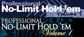 Both have "Professional" styled the same: on a separate line from "NLHE", with the same font as "NLHE", a smaller size than "NLHE", and left-aligned with "NLHE". Both have "Volume X" off to the right in a script-style font. Both have "Volume X" slightly overlapping with "NLHE". |
 |
|
|


 Hybrid Mode
