|
#16
 07-24-2007, 12:53 PM
|
|||
|
|||
|
Search for higher quality pics. You never want to have to scale up you will lose resolution. A great way to remember design layout is CRAP
Color Repetition Alignment Proximity. Suggestions Lose the brother unless you want to include his name. Fade out the flag so it doesnt stick out. Align the logo and the name so they look like they belong together. Find a bigger picture of Mikko. If you leave Lord Stanley in there make it bigger and allow it to bleed of the page. I looked back at some of your older ones and you are definitely improving. The more you can practice the easier it will get. Another idea is to look for examples anywhere you can find them. Magazine ads and brochures will help you with alignment and proximity. Keep posting your work. 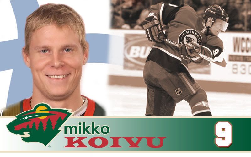

|
|
|


 Threaded Mode