|
|
|
#1
 07-22-2006, 08:19 PM
|
|||
|
|||
|
First place goes to...
 Why: I think the maroon background along with the gold title letters give it a distinguished look. Gives the ambience of a private bank with expensive wooden furniture and paintings with gold leaf baroque frames. Runner-up is...  Why: the black background gives it a very authoritative persona. 
|
|
#2
07-22-2006, 10:08 PM
|
|||
|
|||
|
Clearly, it's Hilgers ITH.
---Leavenfish
|
|
#3
07-23-2006, 01:01 AM
|
|||
|
|||
|
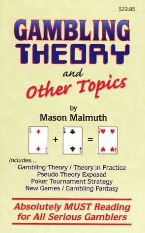
Hi Everyone:
My candidate would be my own book Gambling Theory and Other Topics. It changed our name from Malmuth Publishing (which our attorney originally gave us) to Two Plus Two Publishing. Perhaps someone could post a big picture. best wishes, Mason
|
|
#6
07-26-2006, 12:14 AM
|
|||
|
|||
|
I have always hated that "Seriously must reading" slogan. It's such a wierd combination of words and just annoying.
|
 |
|
|


 Hybrid Mode
