|
#211
 06-11-2007, 09:16 PM
|
|||
|
|||
|
First, your covers will grace my living
room soon I hope, sir! Second, Thank you so much for your kind and honest critique. I was messing with red today, but it looked like a horror novel! I hope to have a variation or two before the deadline; I'll play with the fonts as well. MASON, et al: are there HiRes 2p2 logos avaiable to incorporate or will Creel replace FPOs at the prepress stage? -ZEN |
|
#212
06-11-2007, 10:04 PM
|
|||
|
|||
|
[ QUOTE ]
MASON, et al: are there HiRes 2p2 logos avaiable to incorporate or will Creel replace FPOs at the prepress stage? [/ QUOTE ] I can hook you up tomorrow morning with a hi-res 2+2 I did, I'm away from the house atm. Also thanks for your comments |
|
#213
06-12-2007, 12:34 AM
|
|||
|
|||
|
Hi Gonso:
I'm going to let you know right now that almost all your cover submissions are too dark for use on a book shelf. Successful covers, which aid in selling books, are covers that catch someone's eye. If the design is too dark, even though it may be a very nice design, it defeats this aspect of the cover. Best wishes, Mason |
|
#214
06-12-2007, 12:38 AM
|
|||
|
|||
|
Hi Zen:
[ QUOTE ] MASON, et al: are there HiRes 2p2 logos avaiable to incorporate or will Creel replace FPOs at the prepress stage? [/ QUOTE ] Creel has all this stuff and they'll drop in what is necessary. In any case, our graphics person at Creel will work with the cover designer to handle this aspect of the cover. Best wishes, Mason |
|
#216
06-12-2007, 01:32 AM
|
|||
|
|||
|
[ QUOTE ]
Hi Gonso: I'm going to let you know right now that almost all your cover submissions are too dark for use on a book shelf. Successful covers, which aid in selling books, are covers that catch someone's eye. If the design is too dark, even though it may be a very nice design, it defeats this aspect of the cover. Best wishes, Mason [/ QUOTE ] I've actually got a pitch black layer on the background at 20% opacity which is dampening the colors. The raw background unfiltered has enough color depth to stand a lot of lightening, although you can forget about ToP yellow with that texture. The colors are strong though, even if they're not especially bright - there's something of a tradeoff esp with the blue color. What you gain in lightness you could lose with color depth (which also catches your eyes), but I'll mess with it tomorrow. |
|
#217
06-12-2007, 01:48 AM
|
|||
|
|||
|
Hi Gonso,
Nice improvements. I can't help but notice, however, a striking similarity between Roxy's title text and your title text. 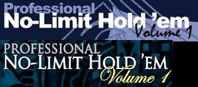 Both have "Professional" styled the same: on a separate line from "NLHE", with the same font as "NLHE", a smaller size than "NLHE", and left-aligned with "NLHE". Both have "Volume X" off to the right in a script-style font. Both have "Volume X" slightly overlapping with "NLHE". |
|
#218
06-12-2007, 01:50 AM
|
|||
|
|||
|
Hi Gonso:
Keep in mind that the decision as to which covers are selected are going to be based on exactly what I see here. So if your cover, or anyone's cover for that matter, appears darker here than what it actually would when printed, that does me no good. Best wishes, Mason |
|
#219
06-12-2007, 03:34 AM
|
|||
|
|||
|
I'm no graphic artist but "Volume" sticks out as too ornate to me.
|
|
#220
06-12-2007, 04:54 AM
|
|||
|
|||
|
[ QUOTE ]
Hi Gonso, Nice improvements. I can't help but notice, however, a striking similarity between Roxy's title text and your title text. Both have "Professional" styled the same: on a separate line from "NLHE", with the same font as "NLHE", a smaller size than "NLHE", and left-aligned with "NLHE". Both have "Volume X" off to the right in a script-style font. Both have "Volume X" slightly overlapping with "NLHE". [/ QUOTE ] uhmmm...is roxy giving you a cut if she wins? why else would you make such an absurd post? jeebus dude, get a grip... gonso, you are taking some body blows lately with the above bs and mason dropping the 'too dark' hammer, however, please continue to work on your covers....imho they are the cream of the crop. |
 |
|
|


 Linear Mode

