|
|||||||
| View Poll Results: In no-limit its in general correct to steal .... than in limit | |||
| more |
|
4 | 20.00% |
| less |
|
16 | 80.00% |
| Voters: 20. You may not vote on this poll | |||
 |
|
|
Thread Tools | Display Modes |
|
|
|
#1
 06-20-2007, 02:21 AM
|
|||
|
|||
|
Hi Roxysurfergirl00
I'm going to let others make their initial comments before I do. However, Alan Schoonmaker's picture should also go on the back cover as the third picture in a row under the title. Best wishes, Mason 
|
|
#3
06-20-2007, 03:01 AM
|
|||
|
|||
|
Hi Gonso:
No. Foil requires a different type of printing than what we do. Best wishes, Mason
|
|
#5
06-20-2007, 09:31 PM
|
|||
|
|||
|
the covers look great. when will i be able to read them?
|
|
#6
06-21-2007, 05:19 PM
|
|||
|
|||
|
Congrats to all the winners. Very much looking forward to reading the books and to seeing the final covers.
Here's some feedback/advice for each of the covers. Gonso/PNL: I liked the idea of making the Roman numberal I or II the same color (red or blue) as the color used to fill the king. The dark gray on a light gray background is a little too subtle. Also, maybe it's just me, but the column of suit symbols on the right looks just a sliver (pixel or two) higher than the king. Hard to tell for sure without a really hi-res shot. For incorporating the vol # on the spine - How about simply putting the red "I" or blue "II" after the NLHE. OMGuraBot/SNGS: I also liked the black background better. It made the chips stand out more. If the black is too dark, maybe try a background green that contrasts more with the green used on the chip. Also, I think there's a typo on the spine. "go" and "strategy" are not capitalized. Roxysurfergirl/WCHS&SHLHE: Looks like the hardest part of converting your design is arranging this book's really long title. One thing I really liked about your design (PNL version) is how the black script font fell just perfectly inside the light-colored suit symbols on the front cover and spine. I wonder if the title can be reworded so that some of the adjectives come after "Hold 'em". For example, High Stakes and Short-Handed Limit Hold 'em: World Class Advice. Basically, just move some of the words in the title into a subtitle. Can anyone else think of a way to reword and/or shorten the title? Another challenge is keeping the title distinct enough from the Stox book. Mason would obviously have to approve of any change, though.
|
|
#7
06-21-2007, 07:46 PM
|
|||
|
|||
|
Mason,
Here is the cover with red and white for the text on the chip. I think the white is the way to go, as it stands out more and is consistent with the rest of the text. Bozman, Thank you for the feedback. I agree that the black background is better. I tried different green backgrounds, but no matter the shade a good contrast wasn't there. -Jim 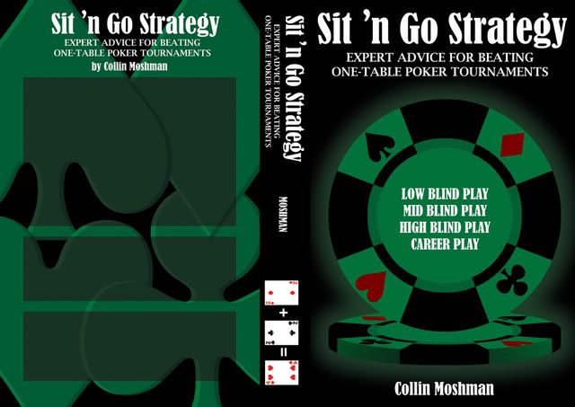 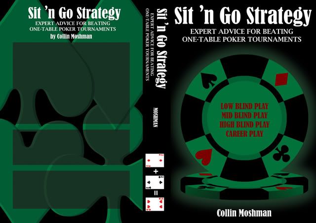
|
|
| Thread Tools | |
| Display Modes | |
|
|


 Hybrid Mode
